LANGUAGE
- Celebrity endorsement - main, single image, close up three shot positions the celebrities as the main subjects - 'meet the plastics' central cover line attracts primary target audience and acts as anchorage text
- Pose - serious and judgemental body language and facial expression for a front cover - links to the typical codes and conventions associated with 'Mean Girls' as it reinforces the clique made between Regina, Karen and Gretchen - entices the target audience
- White and pink original typography - unique - masthead - colour scheme is reminiscent of the film and the musical and the bright colours and contrasting colours attract the fun-loving audience
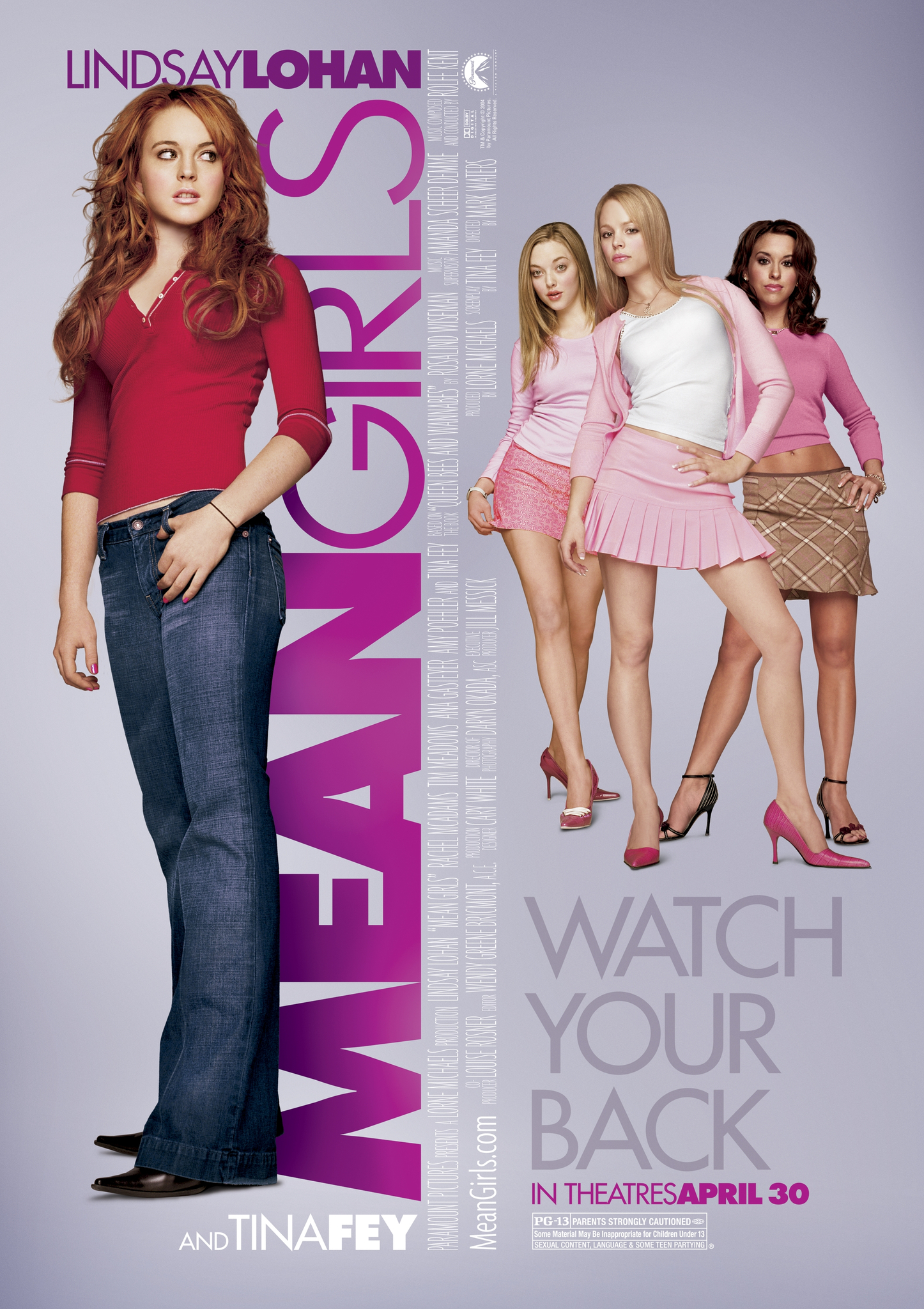
- Use of the Mean Girls typography, for the masthead 'arts' and the smaller coverlines- further emphasises the intertextual reference as this typography was used in the posters and marketing for the film (see below)

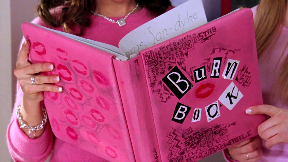
- Similarly the use of the 'meet the plastics' font and the lipstick print symbol is an intertextual reference to the burn book, which is an iconic prop within the film and the musical, a reference which my target audience would recognise (see below)

- 'Exclusive' - tag - engages the target audience's interest
- Main cover line - positioned centrally - anchorage text - reinforces intertextuality and celebrity endorsement
- Minimalist image combined with single cover line - reflects the target audience demographic and brand - typically prefer cleaner covers with more space - less overwhelming and easier to read - creates a brand identity in terms of layout
- Inside Arts - brand name - reflects the entertainment genre and how it is a magazine surrounding the arts - further emphasised through the categories on the contents pages and the website - original typography - creates a strong sense of brand identity across the brand's multi-media presence
- Shallow depth of field - hard focus on the models and a soft focus on the background - draws attention to the main subject - entices audience
- 'www.insidearts.com' - link to website - reflects the zeitgeist - primary target audience would be particularly tech-savvy - reflects how Hearst UK have '17 million UK digital unique users' - this large online presence is reflected through my multi-media products because of the strong link with my primary target audience demographic who would be up to date with modern technology
- Strapline - 'The UK's number one entertainment magazine' - reflects the genre and creates a clear sense of brand identity across the products
INSTITUTION
- Prices - single issue - £2.50, yearly subscription - £40 (consumers can get a 20% discount with Unidays, a subscription service that provides discounts for my primary target audience)
- 12 issues a year, plus additional content through the website and social media platforms - provides constant content for the target audience - keeps the audience's attention between the paper magazine releases - reflects how the institution Hearst UK have a focus on 'creating and sustaining a relevant and meaningful relationship with their target audience who thinks, acts and feels in the same way as the writers and editors.'
- Institution - Hearst UK - a brand who 'host a national conversation about fashion, cooking, fitness, TV, work, celebrities and life' - there is a gap in the industry for an entertainment arts magazine targeting a mass market 16-25 fun loving audience demographic.
- Single, close-up three shot image - brand clearly likes to lay things out - organised, professional and aesthetically pleasing - creates a clear brand identity in terms of layout with the other edition
- Brand identity - original typography of masthead - can be found across the multi-media products
AUDIENCE
- Primary target audience - a fun loving 16-25 year old mass market demographic - it is likely that they would have watched the film or at least heard of it as it is an iconic media text within this target audience demographic
- Secondary target audience - parents of the primary target audience demographic who may purchase the magazine for their children and fans of Mean Girls and interested in the main cover image and attracted through the intertextuality
- Psychographic - predominantly aspirers - young people, layout and design appeal to them, care about image and persona and would seek the status of the celebrities represented on the cover
- VALS category - predominantly experiencers - younger population, first in and out of trends, care about celebrities and entertainment
- Socio - economic group - mass market - content tailored to attract a mass market audience in terms of interests but also in terms of their socio-economic group - good value for money
- Social media - YouTube, Facebook, Twitter, Instagram, Snapchat and website to reach the target audience and create a strong online presence - also allows the brand to collaborate with other artists, institutions and the primary target audience - encourages audiences to be active and get involved according to Jenkins theory of participatory culture
- Blumler and Katz - because of the genre, it would be common for the audience to consume the magazine as a means of entertainment/escapism according to this theory
REPRESENTATION
- Three main subjects - represented as their characters form Mean Girls - body language and facial expression act as further intertextual references to the show and fit with the shows general aesthetic because the girls are represented as a clique through their positioning within the frame
- Brand - represented as modern and trendy through the intertextual reference to a new Mean Girls collaboration and as fun-loving, like the audience, through the colour scheme composed of bright contrasting colours
- Shot type - angle level slightly lower than the model's eye-line - creates direct mode of address - positions the clique represented as somewhat looking down on the audience - reflects the characters representation within the film and musical
- Single image - infers the brand like to clearly lay out their magazines - reflects the brand identity created by Hearst UK
- Challenging stereotypes of a young female celebrities - not being represented as voyeuristic or sexualised but being represented as their characters - however, somewhat stereotypical representation of girls' cliques is used, reflects the representations within the film and musical
- Celebrity endorsement - represents the brand as modern, up to date with latest trends and contemporary - just like the target audience
INTERTEXTUALITY
- Mean Girls typography - combines the brand identity of the show with that of the Inside Arts brand - similarly the use of the burn book font reinforces the reference to the film and musical (see above)
- Colour scheme reflects that of the show title and reflects the aesthetic of the show - an iconic reference from the show is that the clique states 'On Wednesday's we wear pink' - therefore this colour is typically associated with Mean Girls
- "Meet the plastics" - coverline - intertextual reference as this is the name of a song from the musical and is used throughout the original film - this would also entice and engage the target audience as they would want to 'meet the plastics' which they can by reading the interview and getting involved, see contents page
- "The plastics are back" - tag - intertextual reference - this was used heavily on the marketing and advertising for Mean Girls 2 - therefore target audience would recognise the link and also the tag links with how the main feature is about a reunion
- "We have secrets to tell you" - tag - intertextual reference - used in film, musical and marketing - also engages the target audience who would want to know the gossip / 'secrets'


No comments:
Post a Comment